In What Ways Does My Media Product Use, Develop or Challenge Forms and Conventions of Real Media Products?
I think that my media product, a short film, uses many of the conventions associated with such a project. Use of Camera, Sound, Mise-en-Scene, Editing and Narrative Structure were the five main conventions that I wanted to meet in my short film, this is because I feel that if these conventions have been accomplished that my short film will be a success.
Firstly, I am going to talk about the variety of camera angles that I have used throughout my short film. I feel that the camera angle in which the camera is close-up then progressively zooms out of Rachel's face was used well as I think it conveys the amount of fear and sadness at the sight of her parents arguing, the point-of-view shot used in the same scene uses the same conventions of the previous shot as we can still understand how she is feeling but we see how it is affecting her life by watching the argument from her P.O.V. The use of the camera angle when it zooms out of the heart shape I feel finally gives the viewer an answer to what Rachel has been up to and conveys her feelings of love for her parents. Finally, I feel that the succession of cross cuts between Rachel and her mother conveys the message to the viewer that time is passing at a slow rate, this is again shown when the mother looks to the clock which I feel will tell the viewer that she feeling slightly anxious also.
During our film, there is not an awful lot of sound used as the only use of sound is through dialogue and an our soundtrack. The soundtrack was a song that we decided to use in our film at a very earlier stage as we thought that the melody and lyrics of the song were suitable as they can be concieved as being quite sad and slow which suits the overall mood of our film, the song itself is 'Make You Feel My Love' which can be seen by clicking on the link below.
Other than the soundtrack the only real use of sound throughout our short film is through dialogue. Although we decided that we should focus on telling the story through the camera rather than words which is why you could argue that the film is short of dialogue.
When we were using the conventions of Mise-en-Scene in our short film we thought it was important to keep in mind such things as Costume, Props and also Lighting. Probably the most obvious use of costume throughout our project is the pyjamas of which Rachel is wearing, when thinking of costume we thought that it was important to show actually how young she was and her vunerability. Vunerability is also again shown in the film through props, when Rachel goes to the draw and picks them out, it also asks the question of what is she going to do with these scissors. When thinking of costume for the parents we thought it was important to convey the fact that the father had had a stressful day at work and the mother was busy being a good housewife as she arrived, therefore on entry to the shot we made the father look smart yet rumpled and the mother casual but looking nice.
Editing was an important process as during the filming process, we filmed over different days so it was highly important to us to focus on the fact that we didn't make any continuity errors. Therefore Rebecca and Rose, if they had found any continuity errors, would have gone back to re-film these errors. Transitions were also a important part of our film, mostly the fade-in and the fade outs. We don't have an opening sequence and we thought that if we faded in just showing the name of the film, we would be able to get straight into our film which would be unusual as many films have opening titles. Also, the fade out at the end I feel injects a sense of thought into our film as we decided to leave the film when it was uncertain what the parents would do or end up. Crosscutting between the mother and daughter was also important as with hte father away it showed that a long time had passed since he left.
I feel that we challenged the conventions of a narrative structure as we do include Exposition, Development, Complication and a Climax but we do not include a resolution in our film. This was something we thought of right at the beginning of shooting as it leaves the story on a ambiguous note therefore leaving the audience make up their own take on how our story ended.
How Effective is the Combination of your Main Product and Ancillary Text?
I think that the combination between my main product and ancillary texts has been very effective in the way that I feel it has reflected my short film using such things as image, language, font and also colour to portray the same messages given by my main product.
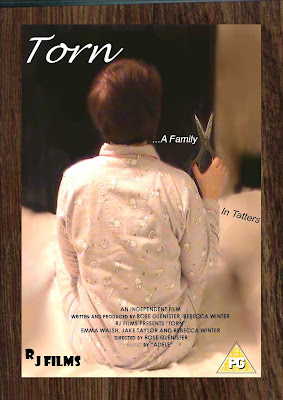
The image that is displayed on our poster I feel is the best image we could have picked as it represents the films ambiguity within the poster, this is something again we wanted to convey not just through the film but also the poster as me and my group felt that using an image which seems mysterious would catch our target audiences attention but also appeal to new audiences. Our finished film poster can be seen below:

We felt as a group that to edit the picture within fireworks and blur the area surronding the girl would increase the attention on the little girl and the scissors in her hand, this we felt conveyed an element of danger and also to make the audience thhink why is the young girl holding scissors and why is she just shown in the image and no-one else.
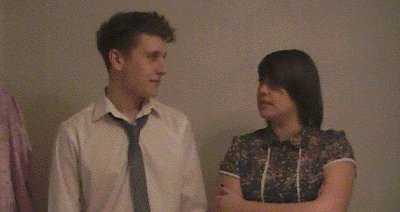
When choosing the image that would be shown in our review page of the film we had to bear in mind that we should use an image that would not give the film plot away but could give the audience a chance to think what this film could be about. This is why we picked the following image:

We chose the image above because we felt that it was quite an empty picture as it shows just the parents of our film but using this still I think worked. This is because the I think the way in which they are looking at each other portrays a sense of again ambiguity but also that the pair of them are worried for their daughter which in turn could be the only thing keeping them together.
Language was an important factor when considering our texts as our film is quite a serious, individual drama therefore when considering the language which was to be used in our review we decided that we should follow the conventions of a film magazine such as Little White Lies instead of such magazine reviews as Empire. This then prompted us to decide that we would use quite technical, serious and at times critical language. I feel that this works as when researching different movie review magazines I found that the individual reviews were the ones which focused more on the film itself and not jokey puns found in some reviews. Also, as our main product is quite technical and clearly serious this again backed-up our decision to use such language.
When deciding on fonts for our poster and our film review it was an easy decision that we should pick Centery Gothic and Ariel as we felt that we should keep the font simple so it does not distract the reader from the language that we have used in the review. I feel that the font used in our poster allows the audience to focus rather more on the image although we found it important to follow film poster conventions by making most of our text in capitals and some areas in bold. Also, I feel that by using a 'simple' text, it does not distract the reader from the review or poster itself.
Lastly, when thinking about the type of colours that were to be used in our film poster and review together as a group we decided that to work with and reflect with our film, we should continue with the running theme throughout our film of darkness and mystery. Therefore we decided to used rather dull colours rather than bright ones as it would not reflect the film. This can be seen firstly on our film poster as the area blurred out is now darker but also other than the dull pink pyjamas that the little girl is wearing the rest of the image is rather black and grey. Also the only other significent piece of colour on our poster is that of the text, which we though was important to show.
In our review, we felt that having the text in just black and white does not only make the still stand out more but also it is simple and does not distract the reader from anything spoke about in the review. The colour in the still again is varied but quite plain as the only source of colour infront of a plain baige background is that of our actors outfits which I suggest focuses the readers attention only on them. I feel that both in our review and poster the colours effectively reflect the mood shown through the film and I feel that this will help appeal to our target audience of people who apprieciate dramas and also to audiences of different film genres.
How Did You Use Media Technologies in the Construction and Research, Planning and Evaluation Stages?During the Construction, Research, Planning and Evaluation stages of our media product we used many different media technologies such as Adobe Premiere Elements and Macromedia Fireworks.
Firstly, during researching we used the internet to search for different types of short films so that we had an idea of how long and what our own short film should be like. We also viewed some similar projects of past years pupils from our sixth form which I feel was an advantage to us as this gave us a more realistic idea of what our media product should be like as viewing a strangers short film may not give us a great idea of what were are to produce and to what standard it should be. The internet was also used to research another important element of our coursework such as film reviews and film posters, with the help of the internet we were able to research past film posters and reviews from various films to give us an idea of what a top poster and review should look like. This more independent way of research I felt gave me more time and space to look for ideas for my film. We have used the internet to write up our evaluations on blogger as it enabled us to display the thought processes of our films.
When planning our short film, we had to bare in mind a variety of things such as the plot, location, actors, costumes, props etc. We found that using Microsoft Word to note all details of the above and emailing update versions of the list between the three of us helped with keeping things in order.
During the construction phase of our product, this was where most media technologies were used. Firstly, we used a HD Film Camera to record all footage that was to be included within our short film. Before filming our media project we initially practiced filming so that we knew how to work the camera therefore making it easier to film during this process. I feel that using this camera was an advantage to our group during the consruction phase as it was simple and effective to use. After we had completed our filming it was then on to the editing process, of which we became very familar with a program called Adobe Premiere Elements. This program allowed us to cut, cross-cut, shorten and change the footage we already had but also allowed us to add a soundtrack, of which we obtained from youtube, onto the final product. I felt that when using this there was both advantages and disadvantages to the use of this, throughout the process of editing using Adobe Premiere Elements the computer on which we were editing was prone to freezig and glitching many times. This meant that we would fall behind others in getting our final product completed on time, although overall we did get it finished before the deadline and I feel that this was because using the program was also an advantage as it was so easy to use therefore overcoming a regular difficulty. During the construction stage, we also used Macromedia Fireworks to edit our film poster. What we did use in this program was a tool which allowed an image to take a blurred effect which I feel was an advantage as looking back at our completed poster the blurry effect works and focuses the audiences attention to the girl in the image.
Evaluating our short film, film poster and film review was to take place on blogspot as it gave us the chance to set up a variety of blogs which answered different questions concerning our final media product. I feel that using another media technologies such as blogspot to evaluate out media project is an advantage as throughout the whole process of research, planning and construction we have used computers and other media technologies so it would be different to change to writing but also it gives us the chance to post examples of our final products onto our own blogs.
What Have You Learned From Your Audience Feedback?When gathering audience feedback I found that it was important to make detailed and quite thorough which is why we had two different sets of questions to ask our audience after they had viewed our short film. We also filmed a group of our audience after they had seen our film so we could show their feedback in a visual form.
The following questions are those of which we asked our audience to write down and answer just after they had seen our short film, I will also say what they answered and what I can learn from this audience feedback.
What Genre Do You Think The Film Is?
When looking at the audience feedback from this question, a strong majority of the answers they had given was Drama. I feel happy with this because we developed our film to become a Drama and wanted our audience to reliase it fell under this category. Many of the rest felt that it fell under a Sad/Romantic genre, I feel that my film could be seen as this genre due to the plot of the film. One interesting answer to this question was "based on real life", what I learned from this piece of feedback was that the way in which we wanted this film to be met by the audience had been pulled off. When creating the film we wanted it to be as close as to reality as we could get and this piece of feedback has proved this was a success.
What Is The Film About and Could You Follow The Storyline Easily?
The majority of the feedback recieved from this question was that many of the people who viewed our film managed to understand our storyline and understood what the film was about. I was very happy about this as at times our short film can be hard to follow, especially towards the end when it is given an ambigeous ending.
Do You Think The Film Has A Ideological Message and If So What?
Pretty much all of the feedback that was recieved for this question was focused on the same ideological message, this was that if and when parents do argue they must think about their children and how it can affect them more than the parents themselves. I'm happy that the audience got this message as this was what we was trying to portray through our film.
What Was Effective About The Sound? What Did You Like About The Sound?
Much of the feedback about the sound in our short film was focused on the soundtrack of Adeles 'Make You Feel My Love', the audience feel that the soundtrack really worked with the storyline and plot of the short film because it was 'sad', 'emotional' and suited the mood'. I am very happy with this feedback as there was a few different songs we were thinking of using as a soundtrack but now I have learned that we picked the right one. Although, not many people who viewed our film picked up on the lack of dialogue. This is abit dissapointing as we felt that the lack of dialogue could make the film more effective but was only noticed by a small majority of the audience. Neverthe less, this could be a postive thing as it may mean that our film was more realistic, natural and what could happen in an everyday situation.
What Was Effective About The Camera Angles?
The close-ups and zooms were the camera angles that most of the audience felt made our film effective, they felt that they went with the mood of the film and were easy to follow. In some cases, the feedback says that the camera is blurry but this may be a problem that occurred when trying to burn our film to a disc.
What Did You Think Was Weak About The Film and Do You Have Any Suggestions To Improve It?
The audience feedback to this question was quite weak although the feedback we did recieve was encouraging but also not too great. The good feedback was that many of the audience said that there was not any weak points throughout our film which is encouraging although the feedback which told us what was weak about our film suggested that the ending was confusing. I think this was because we left the storyline on a ambigeous ending therefore the audience, who were around the ages of 14 and 15, were maybe too young to understand the ending without being told why it was left at that point. I have learned from this feedback that the majority of the audience were happy and understood our short film although some things would be changed in future projects such as the endings.
Below you will find a short video of our group interviewing a few people from our our audience about our film:


